From Idea To Paperback - The Art of Cover Design
- lotenwriting
- Feb 12, 2024
- 4 min read
We are always told not to judge a book by its cover, but it's so hard not to, isn't it? So, I thought it would be interesting to put metaphorical pen to paper and talk about the process I go through when sorting out book covers, whether they be my own, or those for books I help to publish. What I've learnt over the last few years is that it doesn't matter how awful your artistic skills are, if you are going to be involved in creating a cover for your book, you need to have at least a vague idea what you want your finished design to look like. I am very lucky that I am able to work with some incredibly talented artists. Here are my steps to successful cover creation.
Think about other books in your genre. What kinds of covers are popular at the moment? Is there a particular style that instantly marks out books in your genre? Do you want a hand drawn cover or one that uses photographs?
Make a rough sketch of your own ideas. It doesn't matter how bad this is, it's purely to give your cover designer an idea of what you are thinking of. If you can, supplement this with photos of other covers with similar styles/images.
Find an artist you trust. Have a look at work they have done previously. There's nothing wrong with using an artist who hasn't done cover design before, but you MUST make them aware of the placement of things like ISBN numbers if you don't want important images covered up.
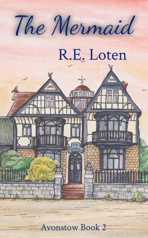
Meet with the artist (over coffee is always nice if you can!) and talk through your ideas - there's a reason I write rather than draw, so I find it far easier to explain verbally what I want. This is where you can also talk about the style of the cover - I use the same cover designer for my adult books and my children's ones, but the style of the covers is very different. If you are writing a series, it's also important to think carefully about future books - you want your covers to be recognisable as a series if possible. 'Folly' and 'The Mermaid' as instantly identifiable as linked books because of their respective covers.
If your cover designer is drawing your cover by hand, you may only get one opportunity to get it right, so make sure before you part company that they have got a super clear understanding of your vision. If it is being created electronically, either by hand or using photo images, then it's much easier to make changes, BUT it's far less stressful for all concerned if you don't need to!
However, to a certain extent, my role in the creation of my covers comes to an end after the meeting with the artist, until the point at which they present their final designs (in the case of photo-based covers), at which point I have to choose which one I want. So, I thought it would be interesting to speak to the two people with whom I work most closely on my covers and understand the process from their perspective.
Jane said, "When considering a cover design for the book, I think about the content first, plus what the author wants, and try to interpret that into a credible and interesting design. I also try to create something eye-catching, something that would make a person pick the book up and take a look because ultimately it is something you want people to buy."
This was what Olivia had to say (and I agree 100% with her judgement of my artistic talents!):
Shortly after we had completed the cover for the first book ‘Folly’ Ruth handed me a folded piece of paper with a scribbled idea on for ‘The Mermaid’ front cover. I’m still threatening to share that initial sketch with the world…
Talking through her thoughts however, I was able to picture quite clearly an image because her description skills are far better than her artistic ones!
Being based on local landmarks I was very familiar with the iconic Anchor building, but this meant it was also slightly daunting: the building has so many details and characteristics that I wanted to include in order to do justice to the beauty of the original.
We then talked about the time the book is set and how that area might have looked. Knowing the area was, at that time, made up of the James and Stone boat building yard, I decided to include a hint of this to the left of the building in order to lead the eye round to the back cover which features the beach huts and Batemans tower used on the cover of ‘Folly’.
I went with the pen and watercolour look to create consistency within the series, but this time added more detail due to area being more built up. We went with the same colour pallet for the sky but this time added more pink tones which gave it a more dramatic feel.
Although the layout isn’t completely accurate, I’ve tried to create a flow by using layers, perspective and soft curves to lead the eye through the image.
Overall I really enjoyed working on this piece and had a clear idea of what Ruth was looking for. I can’t wait to see where we go next.
The original paintings of 'Folly' and 'The Mermaid' (which now hang on my wall in the study) and the final cover designs.
I am incredibly lucky to work with such talented people.


Comments